Sunday, 13 December 2015

Peer Assessment

Initially, I thought that working with a partner was going to be hard, as explaining a make-up look to someone can be difficult as people always interpret things differently. When explaining my look to Alex and her practicing it, it was not exactly what I wanted or had thought my final look would look like even though I had explained it to Alex. I knew that practicing was going to be the best option as I could experiment with products and see what works best. 

Alex was understanding and listened to any advice I gave her about my work and she was helpful in coming up with ideas and the best way to use the products. When practicing with her, I saw areas that I wanted her to improve on and gave her tips and asked her politely to change it. For example, she had not blended the colour around the cheeks or the forehead as much as I would have liked her too, therefore I said next time we practice can we change it. Alex's strong points were her accuracy and her time keeping. I had a heart shape around the forehead and down the cheeks and she was able to do this free-hand with a brush. Working with Alex helped me to improve my communication skills and helped to me to understand how the industry works when you are given a brief from a client that you need to complete. I found that Alex's instructions were easy to go by and helped me to accomplish her design quickly. 

I found that my design was complex and took more time to complete, therefore I was impressed at how Alex worked. The practicing definitely helped as at the beginning Alex was finding it hard. Throughout the unit, me and Alex stayed in communication over social media and came into practice in our own time. I enjoyed the unit and working with her made the process easier. I have become better friends with Alex and would happily work with her again. 

Technical Folder Sign Off Sheet

Wednesday, 9 December 2015

Final Evaluation

Similarly to hair, I have had no previous make-up experience before starting the course, except experimenting with my friends' make-up. I was excited to learn the basics and develop the skills I already had and begin designing my own ideas. Researching and coming up with a range of ideas was something I was used to from studying art last year. 

My communication skills have developed through working with my partner as I initially found it difficult to explain my idea to them. I found making an instruction list with a step by step guide helpful, as my partner always had something to go by. My research skills have also improved as I wanted to find a range of artists work and design ideas that could help me in creating my ideas. I found using Pinterest and Instagram to be really useful as a range of photos were always accessible. When developing my research I found completing my favourite design on myself helpful as I could see what products worked and what ideas work best before handing my partner my favoured design. 

I really enjoyed working with Alex and her design, as it was simple and was something I felt confident in achieving. Through practicing and asking her questions about her design, the process was a lot easier as I was able to understand what she wanted and she was able to make any changes.  To begin with, I found working to the brief harder due to my designs being too contemporary and the Elizabethan inspiration was lost. I tried to focus on looking at Elizabethan portraiture and symbolism in colours for inspiration. Between me and Alex there were not that many problems we had to overcome. We tried out different techniques and products to see which worked best. Alex also had to focus on timings as my design was complex and featured sections that were detailed. If I were to complete the unit again, I would look at practicing both mine and my partners design again to ensure they were perfect. 

Wednesday, 2 December 2015

ASSESSMENT - Designer - Me, Make-up Artist-Alex


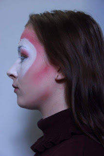
For this assessment Alex completed my Elizabethan inspired make-up design and created something that represented my Lady in waiting and my final design. 

For the assessment she had prepared her station and I gave her my designs and images of practice sessions. We had practiced my design in preparation for the final assessment and Alex felt confident of completing my design. Features of my make-up are complex therefore through practicing she was able to improve on her techniques and complete it to my desire and to her highest ability. During the assessment Alex was a lot more precise with each section of my design and just completed it within the time. My design featured a heart shape around the eyes and down the cheeks. Thankfully, Alex had a very steady hand and was able to create an accurate and symmetrical shape. I wanted the outside of the heart to be outlined with a pink blush and then blended upwards. Alex did this perfectly and was the best she had ever completed it. I feel like the colour was the right shade and worked perfectly around the heart and on the face. The only criticism I had of my make up look was that I would have liked the white on the eyelashes to be more visible. They are not that visible in the photographs. Alex was worried about getting the white on the eyeshadow. If there would have been time left after I would possibly have asked her to curl my eyelashes however when designing my final look I knew my eyelashes were long anyway so did not think this was needed. The jewels that I had on my face were small in size and therefore were tricky for Alex to apply quickly. She used tweezers to hold them, however they kept slipping through. As she applied more it became easier for her to apply. Originally, I wanted them around the whole of the heart, however due to the time limit I change it to just the top. Overall, I was really pleased with my final design and the way in which Alex had completed it as my make-up artist. 

Alex was very professional and worked well under the timed conditions. As my design featured many complex parts she worked well to complete these to a good standard. She was always asking me questions and helping me to improve my design and giving me her own ideas about the best way to complete the look. I found this extremely helpful and felt we both worked well together as partners. 

My design featured jewel adornments on the face that Alex had to apply around the heart. I bought a set of these which featured a range of different sizes. The biggest size worked best for my design and would be easiest for Alex to apply. When we first practiced Alex did not have any tweezers so she had to use her fingers. This was extremely hard to apply the glue and then place on the face, therefore we knew that she had to use tweezers. During the assessment applying the jewels was a lot easier. Through practicing my design, me and Alex worked together to find the best products to use and overcame any problems. For the white on and around the eyes we used the supra colour and then used a flat brush to blend in with with base. Alex had the idea to use a white eyeshadow to blend the white base. This worked so much better and the look as a whole improved and looked more professional. The rest of the products I had originally planned to use worked perfectly so nothing else had to be changed. I found explaining the make-up to my partner quite hard as they can only go by what you tell them and your design. Practicing the design definitely helped as I did not want to come across as bossy towards Alex. Having her asking me lots of questions also helped as I knew that she wanted to perfect the design for me and to complete it to a standard that she was happy with. I have really enjoyed designing a range of different make-up looks and portraying them through a lady in waiting. I think it works perfectly with my characters story and background. I tried to focus the interpretation of her through colour. I am pleased with my final design but if I had to change anything about it I would look at featuring more gold through the design as I think it would have complemented the pink perfectly.  

Tuesday, 1 December 2015

ASSESSMENT- Designer - Alex, Make-up Artist, Me


For this assessment, I was the make-up artist for Alex's Elizabethan inspired make-up. I completed this in the time given and photographed the final look showing different angles. Overall, I am really pleased with the final outcome and how I accomplished it. I feel like this was to the best of my ability and took into account all the new techniques we had learnt over the past few weeks.

In preparation for the assessment I practiced Alex's design and found it simple and easy to do. There were no complex sections to it other than the eyes but I felt confident that I could achieve the look Alex desired. Before the assessment I was feeling confident in my ability to complete her design. I arrived at the studio fifteen minutes before we were scheduled to start to set up my station with all the products needed. We were told to prepare our clients skin and then wait to begin. Unfortunately Alex was late to the assessment so I was behind from the start. I kept calm and acted professionally as it was not my fault that she was not there. She arrived and I worked quickly and efficiently in preparing her skin for the make-up. Sue had said to me that I would be marked on what I could do in the time I had left, however I was determined to finish her design to a high standard. I managed to complete this which I was very pleased with. Alex had also forgotten her design however, I could remember it through the practice we had done. The eyes were the section that I wanted to put the most time and effort into as they were the main feature of her design. I wetted down the eyeshadow and applied over 3/4 of the lid leaving out the inner corner. Around the edges I used a smaller brush to be more precise and use an angled brush to create the line down the nose. I used small lines to create the outline so that there was less chance of it going wrong. I was really pleased with how it looked and made sure that each eye was the same. Using a blending brush I added the same colour on the outside and blended upwards. I kept looking in the mirror to see if the angle needed changing or whether more product needed applying to blend the two different consistencies of eyeshadow. The final outcome came out really well and I'm really pleased with it.  

Alex's design was very simple and easy to complete. The simplicity of the face made the eyes stand out which is what Alex wanted to achieve. Due to this I made sure that eyes were perfect and precise. I enjoyed working on this design and as a make-up artist to Alex. Whenever I asked her questions about her design she gave my helpful advice and guidance as to what she wanted. I found communication with the designer to be a key factor.  Alex was great to work with and made my job as the make-up artist easier. 

Her design did not feature any other materials on the face such as adornments. I therefore did not have to think about incorporating this into my time and could focus on the make-up. The only thing she changed about her design was the eyes. Initially she wanted the eyes to be red and black. Sue told us about applying water to the eyeshadow to change the consistency and make it more into a paste. Alex decided to try this and really liked the look. I had to make sure it was dry before she opened her eyes otherwise it started to crease on the lid. She asked me to feather out the edges so the lines were not as harsh. She then wanted to add the eyeshadow in its normal consistency to the outside to create a blended look. I completed this on Alex and she decided to change her original idea to this. Practicing therefore allowed me to see what Alex liked and for her to change her ideas to something she preferred. Other than this we did not have to overcome any other problems with her design. Working with Alex as a designer made the process easier for me as she was approachable if I needed to ask any questions about her design. She listened to me if I had any advice for her as well which I found rewarding. Overall the process of being the make-up artist for Alex's design was really enjoyable. I was able to have a slight insight into the industry and what it's like to be a make-up artist. I have learnt that you always have to be professional no matter what as it will give you a good name in the industry. 

Sunday, 29 November 2015

#2 Practice

Me and Alex both decided that it would be a good idea to practice my look again so she could try out the changes we had made and any think she didn't feel as strong on. This time I had the jewel adornments that Alex could try out. For this practice Alex went by my face chart. 

The base that Alex did was perfect and the heart was symmetrical on both sides. However this time Alex made the contour and edging of the heart too red. This was not a problem as she know knew for next time to make it more pink. She completed the eyes and eyebrows fine. We tried using the gold from the supra pallete however it was hard for the brush to pick up the product. For this practice Alex used the white eye shadow to help blend the White supra into the base. This worked perfectly and helped act as a powder. Also I had the jewels to apply to the face. Alex had forgotten her tweezers so had to use her fingers to apply them to my face. She found this hard but in the assessment she would have the right equipment to  complete this. They worked perfectly with the look and stayed on really well. The only criticism I would have for Alex would be to make sure everything is blended well, especially the contour on the cheeks. She also needs to be careful of the time as there are many aspects to my look which take a lot of time and precision. 

The practice definitely went a lot better than before. Alex only has a few things to work on for the real assessment but they can be easily applied. I am feeling confident for the assessment and my design is coming across how I want it. I am excited to see the final outcome and have really enjoyed working with Alex so far. We are always in communication which I have found to be key in this assessment and has made the process easier. 


#1 Practice of My Design - By Alex

When I first gave my design to Alex she seemed confident that it was something that she would be able to complete. I showed her my face chart and explained the ideas behind this design and the products which I wanted to use. Some sections of my work were harder to perfect and needed practice. I was also unsure of some of the products I would be using as there was a variety that were the same colour or consistency but I needed to see which worked best. 

To begin with Alex used the kryolan foundation pallete in the shade Ivory and -. She applied this all around the face however did not make it as precise around the eyes and eyebrow as I wanted this section to be white. Around the eyes and down the cheeks Alex created the heart shape that would be filled in white. She had a very precise hand so found making each side symmetrical fairly easy. I wanted the white to blend in to the base. This is something that Alex could work on as some of the lines were slightly harsh. To outline the heart she used a pink blusher around the edges and blended it upwards towards the hairline. I want and even colour that gets lighter at the top. Me and Alex spoke about using two shades of the Kryolan blush palette and blending them both. I want this to come down the cheeks to add a deep contour. I told Alex to use the same shades but to add in more depth by using a red and to add a slight hint of purple. 
On the eyes Alex added the gold shade from the illamasqua liquid metals palette cross the lid. To add depth to this she added a pink and red to blend the gold. Using the pink combines the whole look. I said to Alex that I wanted it blended upwards and outwards. Next time we practice she can make sure the eyes are blended thoroughly and that there are no harsh lines between the eyeshadow and the white. She then used the white supra colour to black out the eyebrows and to be used on the eyelashes. Alex did this really well and the only thing that I said to her was that I wanted the eyelashes to be as big as possible. For the lips she used combined a pink and red shade to create a colour that was similar to the blusher. In the middle of this she placed the same gold colour as on the lid. I want to place jewels on the face however I had not bought these. I said to Alex that the next time we practice I will have them for her to try out. 

Overall, I was fairly happy with the first practice however there were small adjustments that need to be changed. To help blend the white together we will use a white eyeshadow to blend this with the foundation. I also want the look to be blended a lot more and for everything to be precise. With practice this will allow her to achieve the look that I desire. Alex took direction and advice well and even though my design is quite complex she managed to complete a great first attempt. 


Friday, 27 November 2015

White Elizabethan Look

Sue wanted us to create a white Elizabethan look using a white base, blusher and white eyelashes and eyebrows. This could be a typical Elizabethan look or a contemporary version. I decided to go for a typical simple Elizabethan look to see what it looked like as whole look with modern products. 
Products used
- Illamasqua skin base
- White supra colour - eyebrows and eyelashes
- pink kryolan blush - cheeks and lips
Tools
-Foundation brush
-buffing brush
-blush brush
-mascara wand
-powder puff
-angled brush

I used the blush on the lips as I knew that Elizabethan women had coloured lips but it wasn't a lipstick formula therefore I did not think it was appropriate to use my lip palette. I placed the blush on the apples of the cheeks to create a more circular shape. Elizabethan women had pale or no eyebrows therefore I blocked in my eyebrows with the white supra colour as this was thicker in consistency. As I have naturally dark eyebrows I found it harder to whiten them completely as I tried to avoid getting it on the skin. I also found that the white on the eyelashes was not as visible as the supra colour does not have a curling effect on the eyelashes like modern mascara.
I was really pleased with the overall look as I was able to see the difference between historical Elizabethan and modern day make-up. It also amazes me how much make-up has developed over the years and the amount of products that people know use. Nowadays people want the opposite to what Elizabethan women wanted. 


Elizabethan Inspired 
The white Elizabethan look that I completed was created due to the white complexions that women in that era were seen wearing. A white face was seen as healthy and was a look that every woman desired. Images from the Elizabethan era were noticeable due to this aspect seen on all women. A white face was a typical look and therefore I could easily create this with the products I had.  They used cosmetics and products to change the colour of their skin. I had to use products on top of my original skin colour to change this. 

Thursday, 26 November 2015

Alex's Design Notes For Me

Tools. 
-foundation brush 
-powder triangle 
- contour brush 
-blush brush 
- flat brush
-water 
-blending brush 
-2x angled brush
- Mascara wand

Products. 
- illamasqua skin base
- maybelline matte foundation 
- Illamasqua powder 
- illamasqua sculpting duo
- kryolan blusher palette 
- kryolan eyeshadow palette - red 
- Mac pallete 
- White supra colour
- kryolan lip pallete 
- gloss 

Instructions. 
- Mix foundation with Illamasqua skin base to lighten it and apply all over face. Be aware of ears, neck and hairline as it is paler than clients natural skin tone. 
- Powder all of face to set the base. 
- Apply the contour shade to the cheeks and forehead to brighten the face. Apply a small amount of pink blusher but so it is still visible on the skin. 
- Wet the eyeshadow colour to form a paste. Apply this under eyebrow and down and down the sides of the nose. Add onto lid and be sure to not apply on the inner corners of the eyes. Feather on the edges so they go upwards. Apply same eyeshadow to edges and blend to hairline. Be sure to make sure the colours are blended. 
- Line eyelids with brown/purple shade. 
- With the same shade fill in the eyebrows making them point at the end. 
- Use mascara wand to apply the white to the eyes.
- Apply pale lip colour on lip and then darker colour in the middle. Make sure it is visible on the lip. Apply gloss to lighter section. 

Monday, 23 November 2015

My Design Notes For Alex

Tools. 
- foundation brush 
- x3 flat brushes 
- powder brush 
- blush brush 
- blending brush 
- mascara wand
- angled brush 
- tweezers 

Products. 
- kryolan foundation palette 
- kryolan supra colour in white 
- kryolan blusher palette pink/pale pink 
- kryolan eyeshadow palette 
- gold - illamasqua liquid metals 
- kryolan lip pallete 
- jewel adornments 
- illamasqua white eyeshadow 
- illamasqua pressed powder 

Instructions. 
- Apply foundation all over face. Don't need to pay as much attention around the eyes due to the white that will be placed over the top. 
- In between the eyebrows draw a heart shape in both directions, finishing just above the cheeks. 
- Fill in all of the heart making sure to make the lines as straight as possible. Cover eyes, under eyes and nose with product. 
- When reaching the cheeks apply less product and work in a downwards motion. The white needs to blend in with the foundation. 
- Using a white powder, apply this at the bottom to help blend the white into the base. 
- Outline the heart with the pink powder. Pull this upwards towards the hairline and be sure to blend. 
- Using the same colour create a contour at the cheeks and add a purple shade to deepen this. Apply this under the neck and chin. 
- Place the gold colour all over the lids and blend with a pink eyeshadow. To deepen this add a darker pink in the crease and blend it outwards and upwards. 
- Block out the eyebrows using the white supra colour. Go in the opposite direction of the hairs to begin with and then in the natural direction. 
- Use the same white on the eyelashes. 
- For the lips mix together the pink and red shade so it is similar to the pink on the cheeks and forehead. Add the same gold colour into the middle of the lips and apply thoroughly. 
- Using eyelash glue apply the jewels on the outline of the heart at the top. Apply around 5/6 so they line the top of the heart. 

Friday, 20 November 2015

Developing My Ideas and Inspiration

As I looked through my face charts I was deciding on which idea would best fit my lady in waiting, whilst still showing inspiration from the Elizabethan era to give to my partner. I chose the pink and gold themed look. I'm focusing my inspiration from the colours used in the era and this look showed the most amount of symbolism. 
Symbolism in my design:
Gold - wealth, egotistical, passionate, achievement, optimistic 
pink -  romance, love, calm
red - power, strength, passion, desire, manipulative 
purple - royalty, cruelty
Jewels on the face - show purity and wealth
I changed my initial idea and created another face chart incorporating the colours on the face. I wanted the colours to be a symbol of my lady in waiting's personality and her background. 
Make-up
When looking at developing my make-up look, I have decided I want the white around the eyes to be a lot brighter and then blended into the foundation around the rest of the face. I also want the gold and pink to be the two 'stand out' colours on my final look. To show inspiration from the Elizabethan era I will incorporate jewels onto the head to define the heart shape on the forehead. They will add something different to the look and will symbolise the wealth and purity of Elizabethan women. 

Inspiration
As I wanted to develop and improve my final idea I decided to research a range of images and make-up artists work to see if I could find any inspiration. I knew that I wanted to focus on pink, red and gold as my primary colours.  These four images stood out to me as I loved an aspect of each one and are the inspirations for my final idea. I know for definite that I want gold on the eyelid, blended together with pink. Having white around the eye was something I had planned to originally do, however the right image clarifies to me that it is effective and shows an aspect of the Elizabethan era. I also know that I want white eyelashes as it will make the gold and pink on the eye stand out more. 


I then decided to look at a range of make-up artist's work to see if I could find any other inspiration and ideas from them. I came across a particular campaign by Marcus Meyer called Golden Beauty Editorial. He loved metallic make-up and the effect it had on the face. He believes that make-up can be placed all over the face and especially not just the eyes. This is why in this shoot he had the make-up on the eyes and around them in all different directions. I was really inspired by this look and the metallic style of it. As I will be using metallic gold on the eyes and lips, this look is great inspiration for me. I like the deep contour on the face which is what I will be creating in my design using red, pink and purple to define the face. I feel using a metallic gold colour shows a contemporary take on the Elizabethan's make-up. Gold was often seen in their clothing as a symbol of wealth, therefore I want to incorporate this on the face in my make-up design. 


Pat McGrath
Through following a range of beauty accounts and make-up artist's on Instagram, I was fascinated by the latest work from Pat McGrath. She recently announced the launch of her new beauty product. It is a beautiful gold paint, that can be used on skin, eyes and lips and will be launched later this year. She first showcased this new product in the Prada Spring 2016 runway. As I saw this, it reminded me how powerful and striking gold is as a colour.  I feel that using gold in my look will help portray the power of my lady in waiting. Seeing gold being used my McGrath, shows it is a current modern day colour used throughout fashion.  I will be featuring gold on the eyelid and want it to stand out as much as possible, therefore I will ask my partner to place as much product on as possible. 


Hair and Clothing Ideas
Even though we will be assessed on our make-up design, we can still think of the overall look. This includes the hair and what the model will be wearing if you are to photograph lower than the shoulders.  I want the hair to be simple and in a middle parting so the attention is not drawn away from the make-up. For clothing I am thinking of something simple, for example a top with a collar or a high roll necked jumper.  

Elizabethan Inspiration
As well as modern day inspiration I looked at Elizabethan portraiture and takes on Elizabethan make-up from the film Elizabeth. I want to take typical aspects of Elizabethan make-up but make them contemporary. Having looked at all these images I want to feature pink around the face as this was seen on every Elizabethan women. I will also have the lips pink but brighter with gold placed in the middle. I don't want to feature a full white face however I want to have white around the eyes and then blended into the base, therefore showing both Elizabethan and contemporary styles. Similar to the image in the middle, I am going to block out the eyebrows so they are not visible. Looking at Elizabethan portraiture has helped me to decide on my final idea as I am able to see what was worn during the era and change the typical Elizabethan make-up to something contemporary. The image on the left is a contemporary take on Elizabethan hair and make-up. A light coloured base as been used as well as the main feature colour being pink. 


References
(no date) Available at: http://fashionista.com/2015/10/pat-mcgrath-gold-pigment (Accessed: 20 November 2015).
GLAMOUR tries out Pat McGrath’s GOLD 001 (2015) Available at: http://www.glamourmagazine.co.uk/news/beauty/2015/10/pat-mcgrath-gold-oo1-limited-edition-gold-pigment (Accessed: 20 November 2015).
Behance (no date) Available at: https://www.behance.net/gallery/11170559/Golden-Beauty-for-AFF (Accessed: 20 November 2015).
Behance (no date) Available at: https://www.behance.net/Marnusmeyer (Accessed: 20 November 2015).
Golden Beauty editorial by Marnus Meyer (no date) Available at: http://ko-te.com/en/beauty/golden-beauty-editorial-by-marnus-meyer (Accessed: 20 November 2015).
Color symbolism theories (no date) Available at: http://www.colormatters.com/color-symbolism/color-symbolism-theories (Accessed: 20 November 2015).


#1 Alex's Idea

I completed Alex's final look on herself. She wanted a paler face however not a complete white face. I therefore mixed her correct foundation shade that she uses normally and then added the Illamasqua skin base to make it paler than her natural skin tone. She wanted a very natural look on the face as the main focus is on the eyes. I contoured the cheeks lightly using the Illamasqua sculpting palette and added bronzer to the forehead. I then added a pink blush from the Kryolan blush palette to add warmth to the cheeks. On the eyes I used the red kryolan eyeshadow. Sue mentioned to us about wetting the eyeshadow to create a paste like texture that's more pigmented. I used the eyes shadow first however it was not as pigmented as Alex desired. In her design she wanted to add black into the crease however I wetted the eyeshadow and tried it on the lid. It was very pigmented and created a beautiful colour. As the eyeshadow had changed in texture it was not possible to add the black into the crease as it did not blend. Alex therefore had to change her design as what she initially wanted was not possible.   Alex did not want the colour in the corners of her eye so I started 3/4 of the way in. I went all the way up to the eyebrow and further out. I them feathered the edges. When I had completed the whole look she did not want the edges of the eyes to be as curved but wanted a more blended look. I added the same coloured eyeshadow and blended it outwards towards to hairline, ensuring that it was blended together with the first layer of colour. I also bought the colour down the nose slightly. I used a purple shade to colour in the eyebrows and to line the lid. She wanted the eyebrows to be angled so I used an angled brush to create this. For the eye lashes I used the white supra colour and used the same technique we had been taught to apply mascara. Finally on the lips I used a nude colour from the kryolan lip palette and a berry colour to create an ombré effect. The darker colour was placed in the middle of the lip rather the outer edges. To enhance the lip and give a more contemporary feel I added a nude gloss over it the lips. 

Overall I found Alex's look very simple to complete as there aren't many detailed aspects to the design. The simple look allows the focus to be on the eyes which Alex desired. I found that I completed it quickly so I am not worried about the timed aspect of the assessment. On the day I will ensure that I work professionally and make sure every section of her design is perfected. The hardest part will be creating a straight line down the nose, however using an angled brush this should be easier to complete. As the base colour will be lighter than her natural skin tone I will ensure that it is blended well into the hairline, down the neck and the ears. By doing this, the difference in colour will not be seen when I photograph her final look. 

Tuesday, 17 November 2015

Face Chart and Trial

After creating three face charts I decided to develop one my favourite idea by changing specific sections of it. I wanted to add more definition into the face and to some how incorporate white to show inspirations from the Elizabethan era. 

Products used - 
Kryolan foundation palette
Kryolan white supra colour
Illamasqua white eyeshadow
Kryolan Blush palette - mixture of TO and R 21
Kryolan eyeshadow palette - 
Illamasqua liquid metal - gold 
Kyolan lip palette - 
Jewel adornments
Foundation brush
Powder puff
Blush brush
Contour brush
Angled brush
flat brush
Blending brush

Face - I applied the base, concealer and powder like normal to the face. I then created a defined contour to the cheeks to enhance the features and adding a contemporary feel to the look.
Blusher and contour- I wanted to feature reds, pinks and purples into my design. As I have made my lady in waiting mischievous and playful I wanted to symbolise this through the use of colour. I used a deep red and brown for contour. I wanted this to be brighter so I then added a slight hint of purple to warm up the cheeks. I used a lighter pink further up the cheeks for a highlight. I also added this around the forehead and used a darker shade around where the jewels would be. 
Eyes - For the eyes I first placed a white base across the eye and through the eyebrows and under the eye. I blended this downwards into the foundation I had already placed and created a heart shape around the eyes. As I have naturally dark eyebrows it was hard to block them out with white, however in one of our lessons with Sue that week she taught us how to block our eyebrows. I will use this technique for my design. Through the eyebrows I then placed a gold colour. On the eyelid I placed a pale pink colour across the whole lid and outwards as a transition colour. On top of this I placed the same gold colour and blended. In the corner and the crease I then added a darker pink and red to darken the look slightly. I placed this under the eye as well. On the eyes I used black mascara and added gold onto the tips however I think in my design I will use white on the eyelashes instead. 
Lips - For the lips I used a pink shade that was similar to the eyes and cheeks. To carry on with the gold theme I added gold into the middle of the lips. 
Beading - As I was yet to buy beading and pearls I used a silver colour to create them. I went around the eyes and came down the cheeks creating a heart shape around the eyes. I wanted to include this as it represents the heart shape that was often created in the hair of Elizabethan women. In my final design I will use jewels and beading to stick to the face. 

I wanted to see whether this look would work so I completed it on myself to see what products worked best and to see if anything needed changing. I want to make the eyes a lot whiter to show more influence of the Elizabethan era. With the new technique we learnt to block out the eyebrows I will use this in my final design. I think I want the cheeks to be more prominent so I will use a deeper red in the cheek bones.  


Tuesday, 3 November 2015

Design Ideas

1. I have the idea to make my final make-up look quite dark but also glowy. I would like to feature red lips and cheeks but through using deep berry colours to give a contemporary feeling. I want the eyes to be quite smokey but to also feature gold tones on the lid as a symbol of wealth and nobility. The dark colours incorporated into the look will portray the mischievous side of Anne Vavasour. I feel this look shows a true contemporary take on the Elizabethan era however it may be too contemporary as the only aspects of inspiration from the era would be the gold featured on the face. To make it more contemporary I would think about making the face paler than my natural skin colour. 


2. For my second idea I would keep the colours more neutral and use a range of pinks and reds similar to what the Elizabethan's used. I also want to incorporate beads and jewels on the face. I have had the idea to place these either around the eyes or in a heart shape from the top of the forehead and down to the contours of the cheeks. I still want the eyes to be smokey to show my lady in waiting's playful and powerful side, however the pinks and reds would show her more reserved personality as well as her power. Pinks were the only colour that women would feature on their face therefore using this as my main colour would be appropriate. Using a brighter colour will show a modern take. Featuring the heart shape will also show inspiration from the Elizabethan era. 


3. My final idea would be to use golds and silvers and deep reds across the face. The red would show her power and the gold and silver would represent her nobility and wealth. I would use golden tones across the cheeks and create a prominent highlight and contour which would show a contemporary take. The eyes would be golden and smokey and also featuring red as a transition shade on the eye to brighten the look. I would also look at placing the colours around the eye and pulling it outwards as well as on the lid to add a contemporary feel. On the lips I would use a nude colour so the attention isn't drawn away from the eyes. I feel this design is very appropriate for a contemporary Elizabethan look due to the gold colour throughout. Using gold would work throughout as it portrays wealth as well as the personality of my lady in waiting. 


Monday, 2 November 2015

Modern Inspiration - Karla Powell

Karla Powell has always been a large inspiration of mine. I love every piece of her work due to the complexity and the time and effort you can see that she puts into every look. I decided to look through her Instagram to see if I could find any inspiration for my final idea. 
I came across this particular look of hers that features metallic make up with a theme of purple, pink and silver. She was asked by Illamasqua to complete a live demonstration of a look inspired by he 2013 'Envy' collection. She was inspired by their Blizzard nail varnish and thus came the name 'Blizzard Disco'.
Even though this make-up look has no resemblance of any inspiration from the Elizabethan era, I wanted to look at particular make-up looks and styles that I could potentially use. For example, she used white on the eyelashes. Elizabethan women had very pale eyes, therefore this gave me inspiration to use white on the eyelashes instead of black. I also like the metallic colours used in the look and feel this could give a contemporary feel to my final design. I would look at featuring gold or silver over the face to symbolise wealth. I also like the use of contouring with other colours around the cheeks and forehead. I feel this really defines the look and would modernise an Elizabethan look. Looking at artists work really inspires me in brainstorming my best ideas and thinking of what would work best for my final design. 


Reference
Blizzard disco make-up creation demonstrated at.. (2013) Available at: http://www.karlapowell.co.uk/post/67365006803/illamasqua-christmas-makeup-glitter-makeup-purple-hair-i (Accessed: 2 November 2015).

Modern Inspiration - Illamasqua 'Once'

For inspiration for my final design I wanted to look at modern make-up brands and make-up artists for any ideas that can help me finalise my final idea. I find looking at other make-up looks to be really helpful in finding inspiration. 

Illamasqua 'Once'
I remembered that when Illamasqua came in to speak to us they mentioned about an 'Inspire' section on their website that showed their recent make-up looks. I decided to have a look to see if there was anything that would help inspire me. The look that stood out to me was a collection called 'Once'. It happened to show Elizabethan inspiration even though this was not necessarily what I was looking for. Nevertheless, I really liked this look and was inspired straight away. 
I researched into this look and read that in 2014, Alex Box and her team used the Illamasqua 'Once' products to create an Elizabethan inspired design that portrays a subtle and youthful feeling, yet also quite eerie and mischievous. The use of pinks and golds are used to create a pale face with striking eyes and rouge cheeks. These are all aspects used in the Elizabethan era that women believed made them more beautiful. In this particular look, each aspect of the face seems to be emphasised to show a contemporary take on a historic look. The red cheeks are noticeable from a far and the highlighted colour and cut-crease on the eyelids draws your attention to the eyes. 


When I first saw this look I immediately thought of my lady in waiting, Anne Vavasour. The lady in the final outcome looks innocent, however I get the impression that she is also quite manipulating and playful. It works perfectly with Anne Vavasour as she had two sides of her personality. She was manipulating and mischievous as she married men for no reason and also had two illegitimate children. However, many were led to believe that she was falling apart and used this side of her personality to hide this. 

From this look I have taken inspiration from the highlighted colouring on the eyes and the pink tone to the face. Personally, I do not like the accentuated colour on the cheeks as I feel it is too overpowering for the look. 

References

How can we help (no date) Available at: http://www.illamasqua.com/inspire/collections/once/ (Accessed: 2 November 2015).
Illamasqua once... Collection for fall 2014 (2014) Available at: http://www.temptalia.com/illamasqua-collection-fall-2014 (Accessed: 2 November 2015).